Betcha Toolbox
Overview
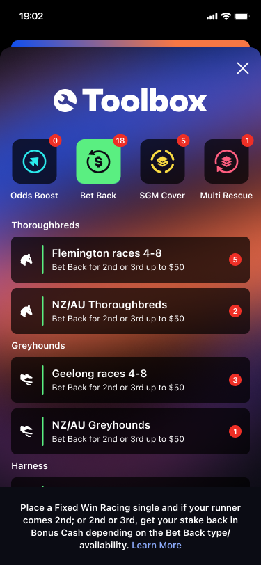
The Betcha Toolbox is a feature accessible to users by clicking on the Toolbox icon in the App Bar. It provides users with access to bet-related promotions categorised by Odds Boost, Bet Back, SGM Cover and Multi rescue. Each of these categories can be accessed via the buttons at the top of the Toolbox, or by swiping through the pages of the view pager. The Category buttons in the Toolbox display a badge with the number of offers available to the user. If there are no offers, then the badge is not displayed. In the event that the number of offers exceeds 99 then '99+' will be displayed instead.

Toolbox Categories
Each Category page contains a list of events or sports for which the user has a promotion available. A badge number indicating the number of promotions available is displayed for each item. On clicking an item in the list, the user is redirected to the page where they can apply and make use of the selected promotion.
The Bet Back page is divided in 3 subsections: Thoroughbreds, Greyhounds and Harness.
Footer and Learn More
Each category has a footer with a brief description of the category and a "Learn More" link that takes the user to a help screen with a description of what the category is about and how the promotions work.
The paths to the "Learn More" React Native screens are:
- Odds Boost:
/how-to/odds-boost - Bet Back:
/how-to/bet-back - SGM Cover:
/how-to/same-game-multi-cover - Multi Rescue:
/how-to/multi-rescue
Empty State
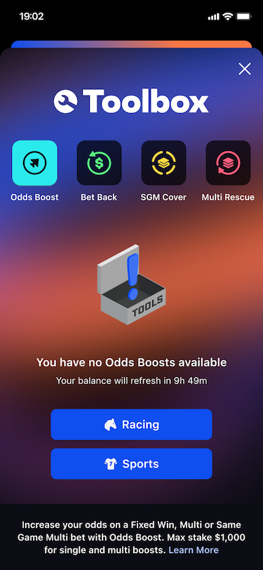
When any of the categories has no items to display, the "Empty State Screen" is shown. This screen notifies the user that there are no items and displays a timer with the time remaining before a refresh of promotions happens. The countdown is hardcoded to midnight Pacific/Auckland timezone. A Racing and Sports buttons are also displayed to take the user to the Racing Home Tab or the Sports Home Tab accordingly.

Animated background and collapsing header
One of the special features of this Toolbox is the animated background. With the distinctive Betcha colour scheme, the blurred background has an animation that makes the colours move smoothly through the background looping every 3 minutes.
The Toolbox header collapses when the user scrolls down on a screen where there are more items than the screen can display at once. It then expands again when the user scrolls up. This increases the space available to display the category items.
List Item Reveal Animation
When a category has a list of items to display, these items will animate in. The item's opacity, blur, offsetY and scale is set to a disappeared state and animates to an appeared state upon view appear. This animation is only triggered in the two conditions:
- When the user opens the toolbox for the first time.
- When a user taps between the categories.
Note that when a user swipes between the categories, no animation takes place. For more platform specific information on the implementation of this animation, see iOS List Item Animation.
Integrations
Feature Flags
toolbox-native- determines whether the native Toolbox is used instead of the React Native version.
Inputs
RN: GraphQLModule: ClientDetailsStartupQuery
- Used to get the client details from the
ClientDetailsStartupQueryfrom GraphQL via React Native. This query contains the Bet Back categories accessible to the user to be displayed in the Toolbox.
RN: ToolboxModule
- Receives updates on the Toolbox items' balances from React Native.
Troubleshooting
iOS
How the List Item Reveal Animation Works
The BetchaToolboxViewModel.PageViewModel (page view model) and BetchaToolboxAppearAnimationViewModel (animation view model) along with the view modifier BetchaToolboxAppearAnimationViewModifier (animation view modifier) comprise the reveal items animation effect. The animation effect roughly happens in this order.
- A new
ToolButtonViewwas tapped and changes thebetchaToolboxViewModel.allowsOnAppearAnimationto true. - Each section and list item has the animation view modifier applied to it. When the section's or item's
.onAppearis called, we log the animation view model's id in theappearedItemson the page view model. - When an item is added to
appearedItems, it's inserted in an ascending order to avoid sorting. - In the
.onAppearon thevar liston theBetchaToolboxProductListView, we setbetchaToolboxViewModel.allowsOnAppearAnimationback to false after a short delay to allow for all the items in theLazyVStackof the list to appear. - The same delay is set in the animation view modifier and after this delay is complete, we can commence animation.
- The animation view modifier will look up its index position in the
appearedItemsto calculate a delay, which yields the stagger in effect. - When the
.onDisappearis called on thevar listin theBetchaToolboxProductListView, theappearedItemsis cleared so it's ready for the next time the page appears on the screen.
Notes:
- If a user 'crazy-clicks' between
ToolButtonItems, then the animation still plays but the stagger is less consistent. This animation will resolve itself when the user resumes tapping at a standard rate. This appears to be a SwiftUI limitation as animations cannot be stopped once commenced.
How the Collapsing Header Works
The BetchaToolboxHeaderView (header view) and BetchaToolboxProductListView (list view) comprise the collapsing header effect. We create GeometryReaders on the list view and the header view to observe the offsetY and height respectively. The list view has a top padding value that maps to the height of the header. The effect roughly happens in the order:
- The user scrolls the list inclusive of when there is not enough items to scroll.
- A percentage value is calculated from the offsetY value of the list. The percentage is calculated from the range of y: 0-150 where 0 means
percentageScrolled == 0and 150 meanspercentageScrolled == 1. - When the percentage updates, the header view is notified via the
percentageScrolledbinding. - The header will then resize itself and update the binding
headerHeight. - The header will scale the logo and the tool button height to 'collapse'.
We do not live update the padding of the list view as this yields ill-desired effects. Instead, the list view has a fixed top spacing value based on the maximum height of the header. The value is only recalculated when the font scale changes.
The scroll position of each list is reset each time the selectedToolboxProduct changes. The header also reset to its maximum height.
Notes:
- SwiftUI sometimes 'forgets' the scroll position of the list. To circumvent this, we check if the
percentageScrolledis 0 when the list appears and then reset thelastPercentageScrolledvalue. - Given the above, sometimes this still isn't good enough and we have some spacing appear between a collapsed header and a list that reset its scroll position.
- The
BetchaToolboxHeaderViewfollows a similar pattern to the above and affects the list view's bottom padding value when it resizes.
These occurences are rare and the list will resolve itself once the user begins to scroll. The asynchronous nature of these updates and the dependency that the list has on the header and header has on the list makes this difficult to resolve completely.
Resources
| Role | Contact |
|---|---|
| PM | TBC |
| Android Lead | Anthony Librio |
| iOS Lead | Nicholas Vella |